a couple of weeks ago i took a trip to south of market over by adac. just around the corner from south of market is phoebe howard’s max & company store so i stopped in since i was in the area. max & company is set up like a home, and each room is designed with a particular theme. i fell in love with the top floor of the store which had a very european feel to it..


close up of the nailhead detail.
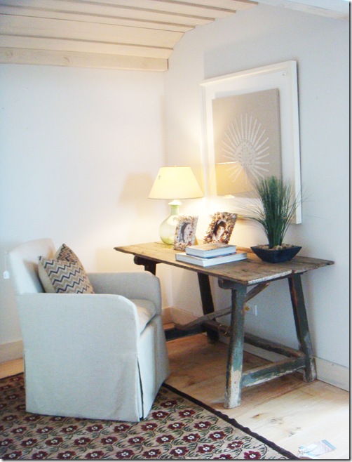
i also liked this little reading nook that was tucked into a corner over by the bedroom area. i wish i had a small area like this in my house to set up like a reading nook…one day, one day.
i would love to have windows like the ones behind this bed. the light poured into the and lit the whole room. natural light is so necessary in designing a home.
for some reason the image below is my favorite one that i took while i was there. the symmetry of this vignette speaks to me.
i didn’t get pictures of the rest of the store but if you want to look at some you can view them on the store website here. if you’ve never looked at them before believe me you will be completely inspired.


0 comments:
Post a Comment